Route diagram
After querying a route, the Open Chart button displays the route chart at the bottom of the screen. The chart can show the following data in graphical form:
- speed,
- distance,
- fuel level,
- speed,
- voltage,
- temperature,
- axle load
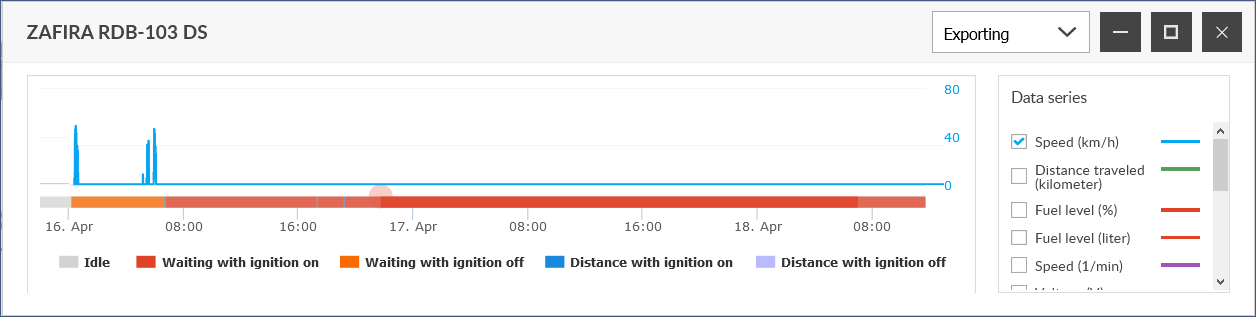
The chart shows the changes for each feature by default for the entire route. If you are only curious about some of this, you can zoom in on the detail you want. To do this, select the desired part of the chart by holding down the left mouse button - the selected part will have a gray background. After releasing the mouse button, the chart magnifies this section.
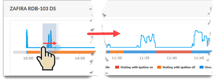
Click Original View to return to the original view.
Using the chart
The chart itself and in conjunction with the map can provide different information, which can be displayed by mouse actions at individual points on the chart and the map.
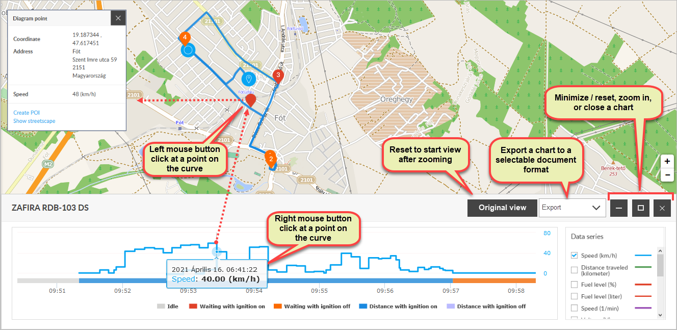
The relationship between the curves in the chart and the data is provided by the color explanation in the Data Series list. Which curves the chart shows can be set in the Data Series list on the right.
The displayability of each data set depends on whether the device has the appropriate sensors installed.
The horizontal axis shows the time (from the beginning to the end of the query time interval), and the vertical axes (right and left) show the values for each time point. The horizontal time axis also indicates vehicle activity (waiting and driving, with or without ignition).
Information on the chart
Right-clicking on a curve in one of the graphs displays time and speed data.
Linking chart and map route points
A point on a curve in a chart can correspond to a point on a map path. If you left-click on a point on a chart curve, the corresponding marker will appear on the map path. You can also right-click on the marker to display the point information panel with point information and related functions.
Additional chart features
The chart window can be moved on the screen by its title bar. The panel can be enlarged, minimized / restored, or exported to a PDF file.