
Route diagram
After querying the route, you can also view some information related to the route in graphical form in the Diagram panel. The chart can be zoomed in / out in the horizontal direction (with the usual two-finger gestures).
The chart can show the following data:
- changes in vehicle speed,
- height change,
- the distance traveled.
The data to be displayed and the format in which the chart is displayed can be set in the Data series and Chart type lists.
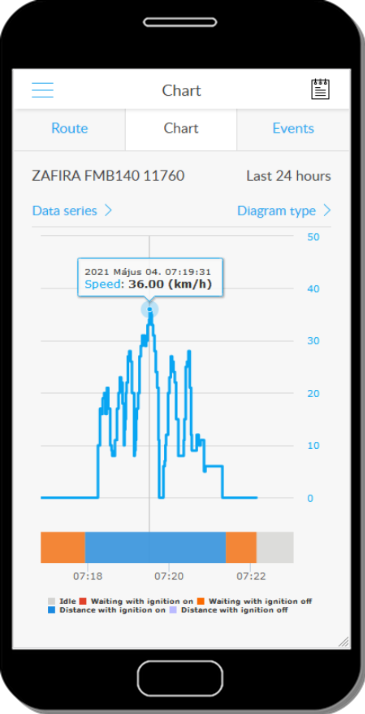
Reading the chart
The relationship between the curves in the chart and the data is provided by the color explanation below the chart and in the Data Series list. The horizontal axis shows the time (from the beginning to the end of the query time interval), and the vertical axes (right and left) show the values for each time point.
If you press and hold a point on the curve, text information about it is displayed.
Relationship between chart and map route points
Tap a point on the curve to display a small point. When you switch to the Route panel, a red icon shows which point on the map corresponds to which point on the map.
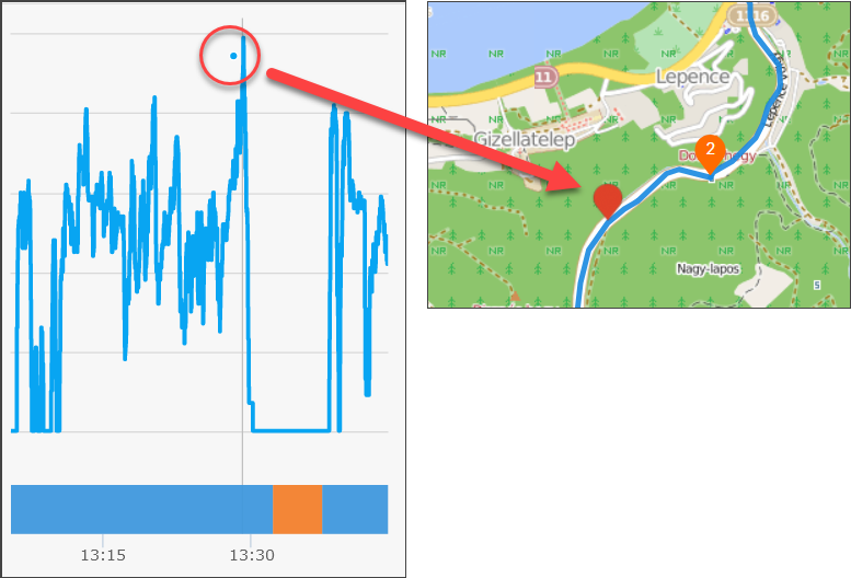
Press and hold the marker on the map to display its information panel.
Tracking easily and efficiently


